An intense chromatic energy radiates from Vicki Stavrou’s new body of work. She imparts that the exhibition’s title, Home Spun, is a play on words. Although the imagery has been ‘spun’ from considerations about a home’s exterior and interior design elements, several of her canvas and linen surfaces are now embroidered with spun tapestry thread.
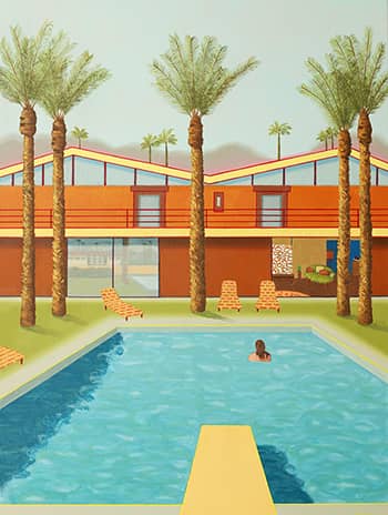
It may seem curious for an artist based in the Byron Hinterland to be painting mid-century Californian abodes, complete with palm trees and prominent swimming pools. Stavrou explains that her inspiration for the subject was fermented when visiting a favourite shop in nearby Brunswick Heads. Called Resould, it specialises in ‘retro’ furniture but also sells magazines from the USA featuring Palm Springs homes from the 50’s era. “When I saw these magazines I just fell in love with the style and lines of butterfly houses, their striking roof directions and the rich ‘anything goes’ colours of the interiors,” Stavrou enthuses. “Wonderful backyard pools – which I think everyone had in the desert – cacti and palm trees everywhere, mountains rising in the distance. I love hot places and this era to me was ‘paradise’ in its ‘tupperware party’ innocence and simplicity.”
Several ensuing paintings have a David Hockney semblance and Stavrou acknowledges an admiration of his works, especially the Californian Paper Pool series. Her depictions however, transcend specific locale in the remarkable organisation of visual relationships and compositional fulfilment. Hazy, cloudless skies and the arrangement of flat, geometric planes promote an atmosphere of stasis and profound silence. The only apparent movement is the subtle, pool water ripples and that of the solitary, occasional swimmer. There is a sense of time suspended and calm integration despite the houses’ brightly coloured facades.
The small, linen works portraying unusual vintage chairs are particularly notable for the abstract shadows they cast. Stavrou discloses that her motivation for the imagery lay in childhood memories of watching the Twilight Zone and Outer Limits television series. She recalls that these programs had a wonderful lighting that conjured imaginings of what might exist in the shadows. Emulating such, Stavrou decided upon painting ordinary objects, in this case ‘retro’ chairs, but with a focus on the shadows. To confer a more significant presence than the interesting forms of the furniture, she filled their silhouettes with hand-sewn tapestry designs. “It gave another dimension, plus tapestry thread comes in fantastic hues so that was a bonus for me as I’m mad about colour!” she adds. “The actual stitching into the linen was quite a meditative and relaxing process but still very creative in its application. I often decided to change the colours so a little bit of unpicking and re-sewing was involved to achieve the end result.”
Other works depict Federation houses, popular at the turn of last century. “I wanted to include something of Australia in the exhibition and these houses really fit the bill,” relays Stavrou. ”The lines, bay windows and triangular roofs are very striking shapes with lots of detailing in the trims and gables. Some had lovely wrought iron gates between the brick fences. Because these paintings are quite small, I chose to do ‘close-ups’ of certain areas.” The deliberate cropping resulted in parts of the houses disappearing from the picture plane. According to ‘realist’ traditions this would violate compositional notions, but Stavrou’s Federation homes are portrayed with a two-dimensional ‘frontality’ organised into hard-edged geometric divisions. Soft- hued, less distinct foliage shimmers in contrast. Her considerable understanding of pictorial dynamics ensures a unified outcome. As in every Stavrou painting, colour impact and the play of luminous visual relationships are her principle concerns.
JACQUELINE HOUGHTON
Receive e-mail updates on our exhibitions, events and more
Subscribe Now