Vicki Stavrou understands the communicative power of colour – it functions as a visual language for her. ‘I am always immersed in thinking about colour. My main goal in painting is to find the most exciting and beautiful combinations that really sing,’ Stavrou declares. In speaking about the exhibition’s title, Golden Daze, she relates that many of her paintings exude an affirmative, golden hue. ‘And sometimes I do feel ‘heady’ being so absorbed in the intensity of my colour choices. Working full-time as an artist is living my dream and that too equates to golden days: Golden Daze.’ Incidentally, the brand of the paint medium Stavrou always uses is called Golden Acrylics.
Although based in the Byron hinterland, Stavrou regularly visits the coastal regions. She describes how Wategos Beach in Byron Bay is the perfect place to experience the ocean’s many moods and immerse oneself in nature. ‘I love to paint Wategos. It is such a rich warm beach with wonderful rock formations and an incredible vista out to Julian Rocks.’ Suffused in a pink radiance, Wategos Afterglow and Wategos Sunrise are beautiful works depicting this area. However, these paintings take us beyond a defined sense of place in her distillation of the observed. Traditional notions of perspective and light are in flux. An almost surrealistic serenity permeates the imagery. The same compelling quality of stillness pervades Yellow Rain at Wategos. ‘I wanted to try out a new colour palette for this scene,’ Stavrou informs. ‘The sky is an eerie yellow/grey. Falling from the white cloud are raindrops rendered in fluorescent chartreuse. Lots of Indian Yellow hue give the rocks a solid, luminous feel and contrasts vividly with the blue/green sea.’
Brunswick Heads is another favourite destination. The works Pylon, Pier, Footbridge and Reconstruction reference two old bridges spanning the river there. Stavrou tells she was attracted to the multiplicity of forms contained within those structures. It’s about finding beauty in the familiar. The paintings again transcend a literal location in the abstract reconfiguration of the bridges’ components. Stavrou’s delight is in the compositional dynamics of shape and colour across the picture plane. ‘The other thing I love about painting these old bridges is illustrating the great contrast of moving sky or flowing water against the hard, flat surfaces of their construction.’
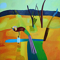
Byron Wetlands Bird 2 is an enigmatic, patchwork-like landscape that captures the nuances of a wetland precinct relatively close to the township. ‘It’s a very secluded, gated area usually only accessed by registered ‘bird-watchers’. The tranquillity and peacefulness encountered there was extraordinary, the only sounds were those of birds and cicadas,’ Stavrou discloses. ‘This painting began as a plein air, watercolour experiment in a new colour palette. ‘I had just wanted to get down a few impressions of the trees and waterways when a striking-looking bird appeared in the foreground! The flowing, transparent colours gave a wonderful layering and so back in the studio I took advantage of those unusual, spontaneously made shapes to create an opaque, but equally rich rendition of my observations.’
A more formal approach invests Stavrou’s paintings of houses. ‘I’ve been drawn to creating images of houses ever since I was in primary school,’ she imparts, ‘but especially since viewing Howard Arkley’s work. ‘House with Leadlight and House with Awnings (selected and hung as a finalist in this year’s Byron Art Prize) were inspired by actual dwellings she’d come across whilst driving through the country towns of Bangalow and Mullumbimby respectively. Having a penchant for ‘most things retro’, they’d caught her attention. Certain architectural and garden elements in each have been altered to enhance the picture. Saturated colours and fluorescent highlights animate the abodes from a bygone era.
The Cactus Garden painting is presented hard-edged in simulation of the house’s contemporary architecture. Situated opposite a friend’s home in Casuarina, it was the garden’s extraordinary array of cacti that kindled her interest. The plants’ prickly, twisting forms were in such a marked contrast. To emphasise their ‘quirkiness’ and give them resonance they are outlined in vivid fluorescent green.
Atypically, the Rosy Cliffs picture was not locally inspired but evolved from a little black and white photo she’d randomly come across. ‘It just looked lovely with the stone houses perched on the cliffs and the tranquillity of the sea below. The finished piece doesn’t look much like the original photo now but it provided a good jumping off point for my warm-hued palette.’ The potency of Stavrou’s works stems from her luminescent colours and remarkable organisation of visual relationships. Her nonfigurative ‘colourscapes’ possess an innate quietude that ushers the viewer into a heightened aesthetic domain.
Receive e-mail updates on our exhibitions, events and more
Subscribe Now